Episode 21 – Rogue Resumes to Sexy CVs – 2. Add Colour
How to add colour to your resume or CV.
Rogue Resumes to Sexy CVs is my technical writing series to help your CV look a bit better in Microsoft Word. In this podcast episode I talk through how to add colour to your CV so your job application doesn’t look so boring. (Skip the intro and start at 6.12) Blog post and screenshots at: https://taku.com.au/rogue-resumes-sexy-cvs-add-colour/
Important notes:
- Curriculum vitae (CV) or resume (also spelt résumé – people often leave the accents off) essentially refer to the same thing. I’m talking about the document you list your qualifications and experience in when you are applying for a job.
- The examples and templates I use are general guides only – some steps may not suit your CV, experience or some job applications. Disclaimer: you may find typos, grammatical errors and random placeholder text in there!
- The series describes the steps for Microsoft Word on Windows.
- If you have questions, leave them as comments and I’ll try my best to answer them.
Download the Microsoft Word template
Your Name Template_Columns (Word, 19 KB)
Before we start, here’s why I think adding colour to your CV is good:
- It makes you stand out. Colour will always catch our eye.
- It softens your CV. Now, for the guys, that’s not a bad thing. I mean it softens it on the eye and makes you personable.
- It shows personality before they meet you, which can help if there are many other applicants sending in boring black and white CVs.
- It shows imagination, especially if you have none.
- The world needs more colour.
Disclaimer, moderation is everything. I’m showing you the basics, but use your discretion to decide how much colour will suit you and your personality.
1. Choose a Theme in Microsoft Word
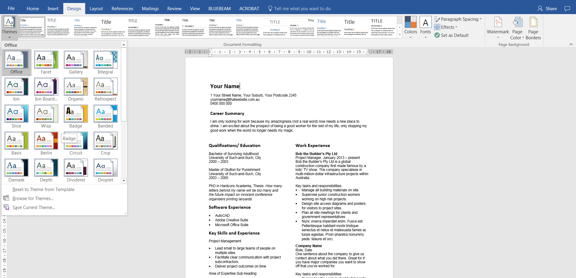
That’s right, Word has a whole range of preset design themes. They have everything already designed and matched for you. Colours, fonts, and styles for each type of text you need to write. It saves you having to guess. Halleluia!
Design > Theme
Select any theme and see how it changes the look of your document automatically.
Then, that row of boxes at the top (that say Title), show different style sets – ways of arranging text styles within that theme. So think of it like a wedding. Bride chooses her colour theme, then you can arrange the cutlery, flowers and napkins in whatever way you like.
There are other things to play with in this tab but we’re focusing on just colour.
2. Make your name bigger
But seriously, isn’t that what everyone wants to do?!
Okay, I digress.
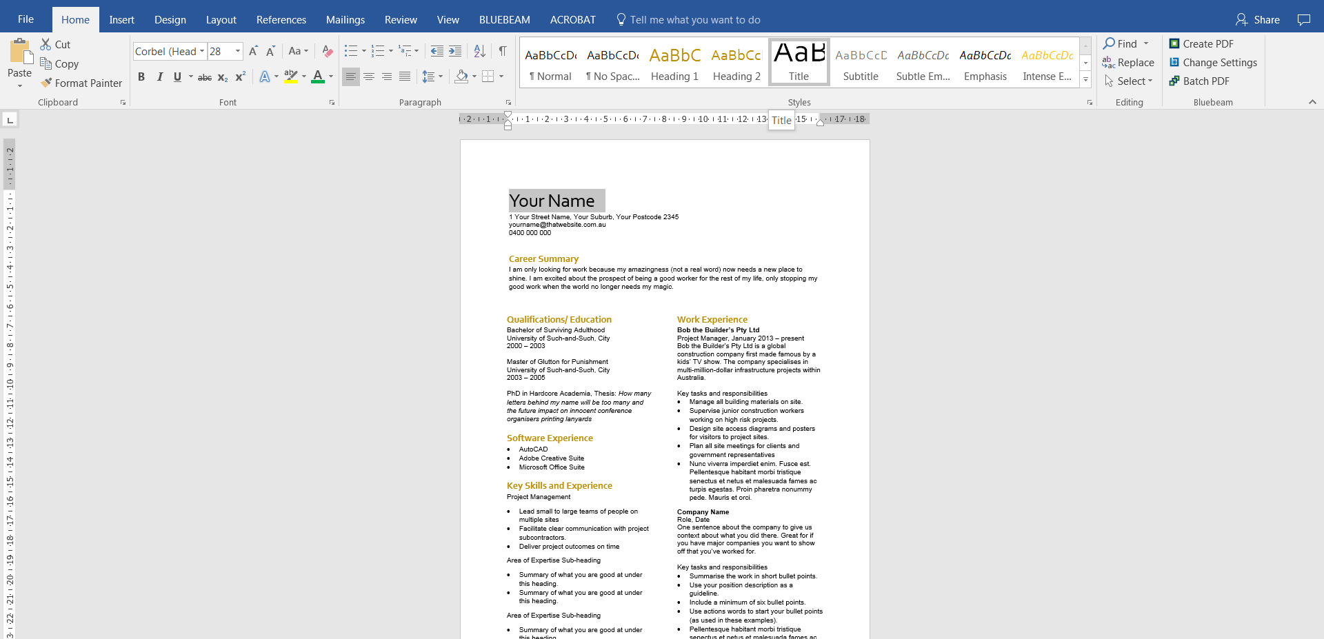
Home > Styles
In a nutshell, the style sets are already set with ways of formatting your text so that it’s easy to use. Normal, is just that – normal text in the body of your document. Heading 1 would be an important heading etc. The one we want for your name is Title. It’s already preset to make your document title, or in this case, your name, look important.
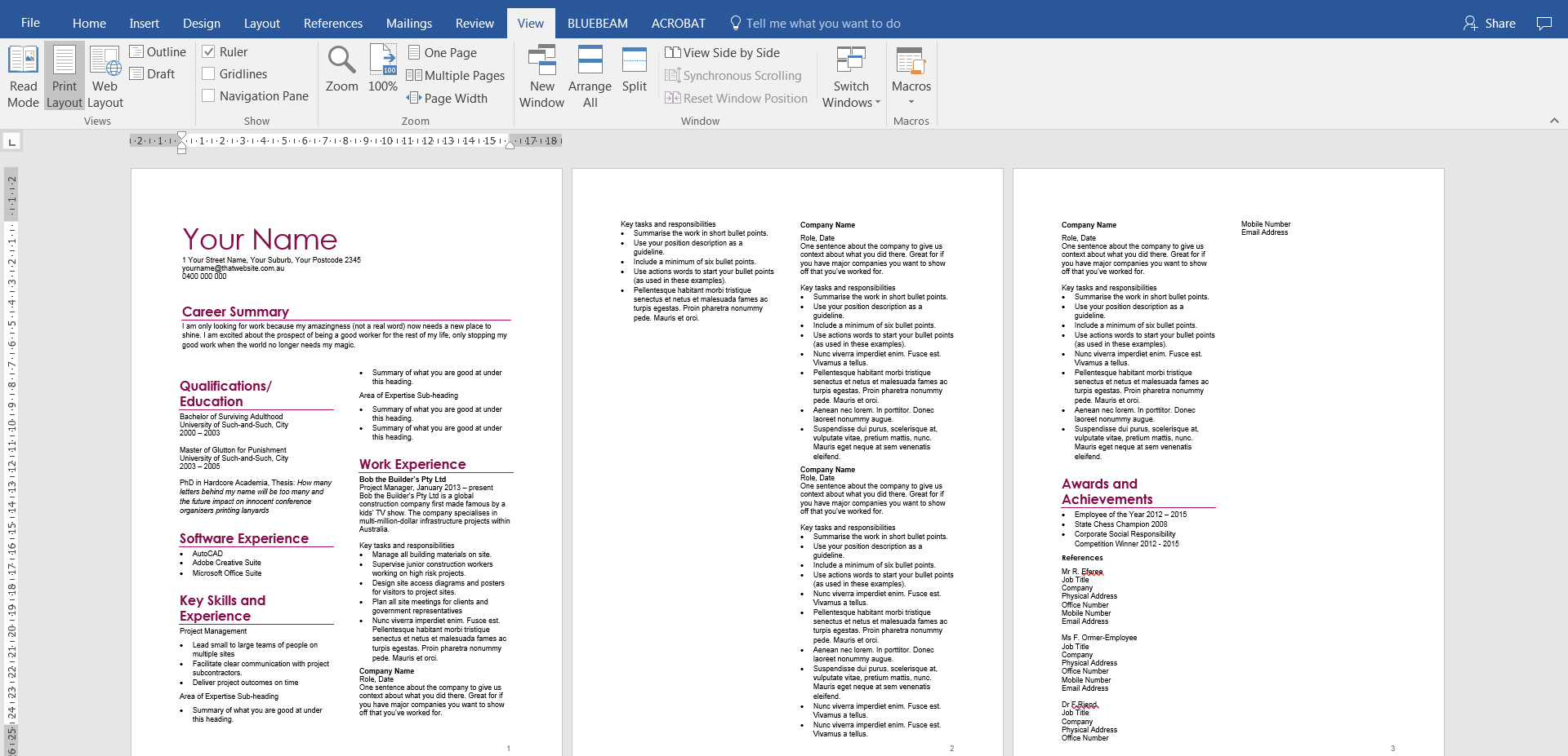
Put your cursor next to your name and select Title. Your name should now be significantly bigger.
3. Change the design theme to see how it affects your name
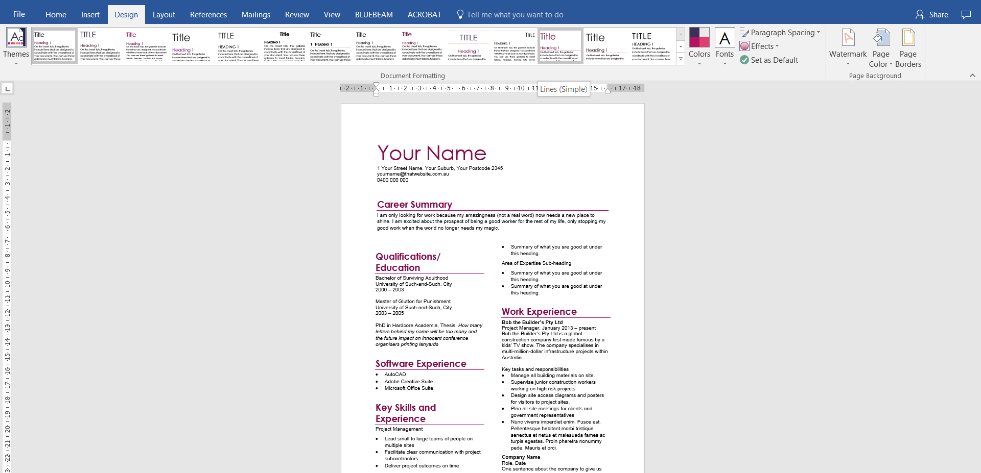
I’m going bold and have chosen the Ion Boardroom theme and the Lines (Simple) style set. Can you see how it has automatically changed the colour and formatting of the text and those other headings? I had already set them as headings in the last episode.
4. Modify heading styles
What happens if you think those headings are too big? You’ve decided you want to be a bit modest. You could simply select each heading and resize it. That may take a little while. You could also press the Ctrl button and select each heading, then resize the font. But that could get fiddly, especially if you have a glass of wine in hand.
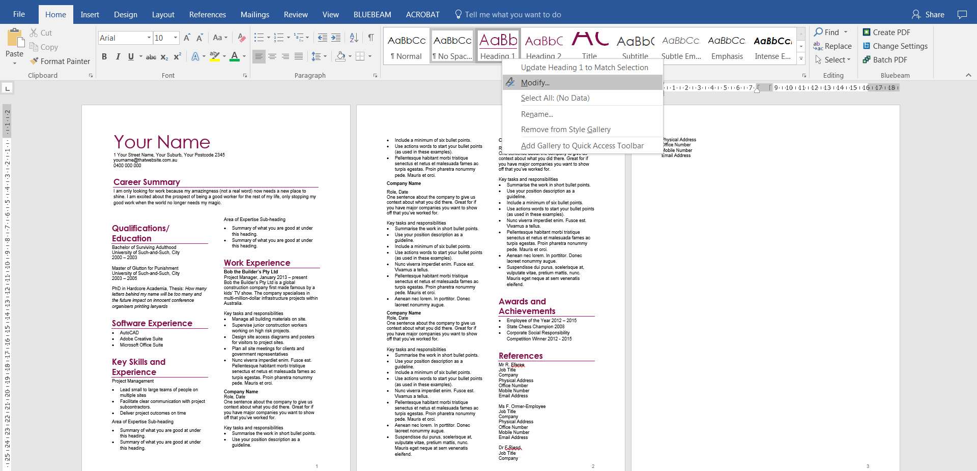
The best and simplest way is to go to the Heading 1 option in the Styles panel and right-click on it. Then select Modify.
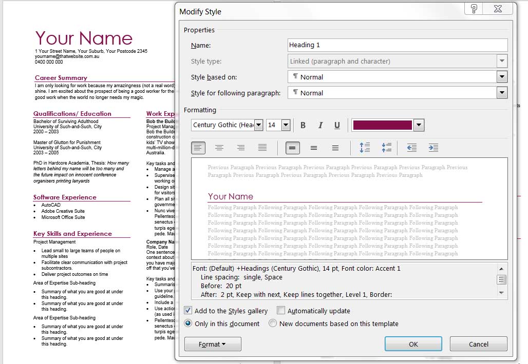
This brings up a window where you can make blanket changes to that text style. Whatever changes you make here will apply to all text in your document that has that style assigned to it. Try it. It is a miracle! These preset styles are literally lifesavers when you are working on documents with hundreds of pages.
5. Fix your section breaks, pages breaks and column breaks
When you change design themes and style sets, your overall CV layout may change. Don’t panic. Our document looks a bit wonky now because the new styles have different spacings and font sizes assigned.
All you need to do is go through the steps from Part 1 – Adding Columns to shift around your text so it sits nicely on two pages.
Et voila! We have added colour to our CV.
6. Save a copy of your file
Or simply download my version of the Your Name Template_Colour, ready for the next episode – adding graphics to your CV.
Your Name CV Template_Colour (Word, 19 KB)

