Episode 33 – The Big Issue with Wonder Woman, Homelessness and Typesetting
In this episode I review the The Big Issue Magazine’s Wonder Woman edition (dated 19 May – 1 June). I focus on the basic layout of the magazine, how the words and images work together and other things that I like about it. Photos at https://taku.com.au/big-issue-wonder-woman-typesetting/
Here’s how the magazine officially describes its work at http://www.thebigissue.org.au/:
The Big Issue magazine is a fortnightly, independent magazine that’s sold on the streets by homeless, marginalised and disadvantaged people.
Vendors buy copies of the magazine for $3.50 and sell them for $7, keeping the difference. Since its inception in Australia in 1996, more than 10 million magazines have been sold, putting $23 million into the pockets of disadvantaged Australians.
I’ve subscribed to The Big Issue magazine for a while now because it’s my small way to help my community creatively. I highly recommend it!
My review of the Wonder Woman edition
In the podcast episode I describe this particular issue, but also talk about the regular sections they include. Side note: I took the photos at Sydney Airport whilst I waited for a flight.
Choose a bold magazine cover
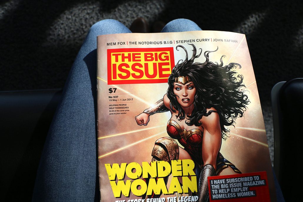
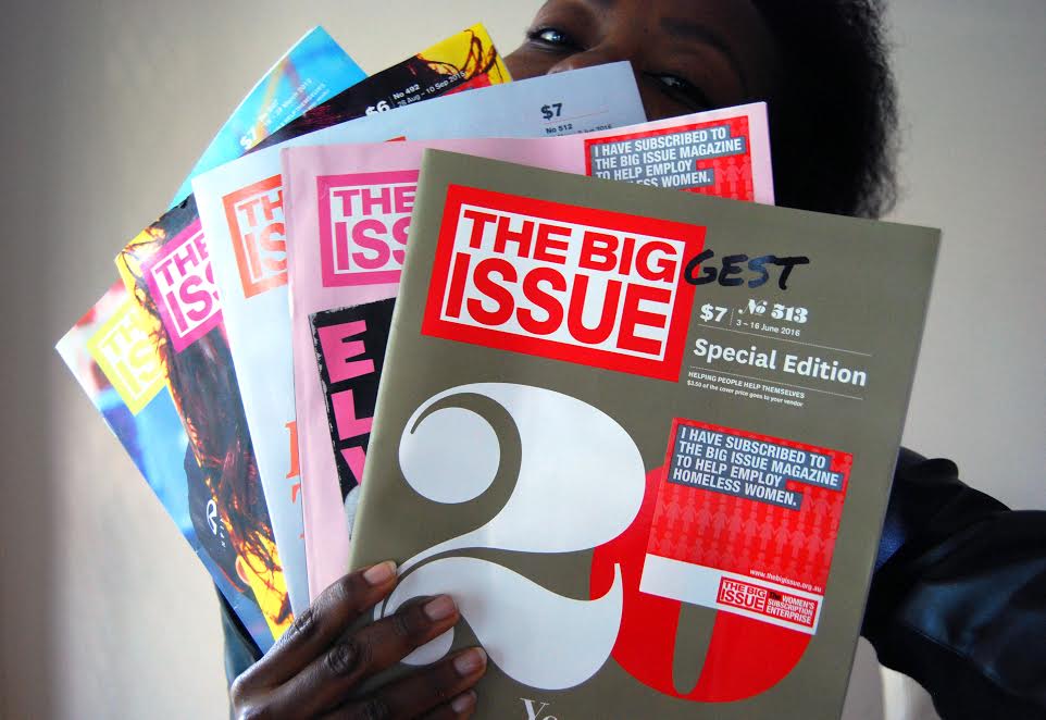
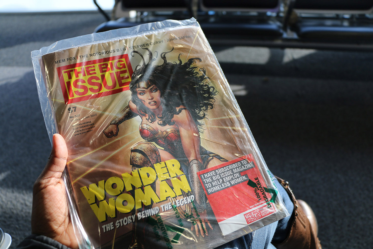
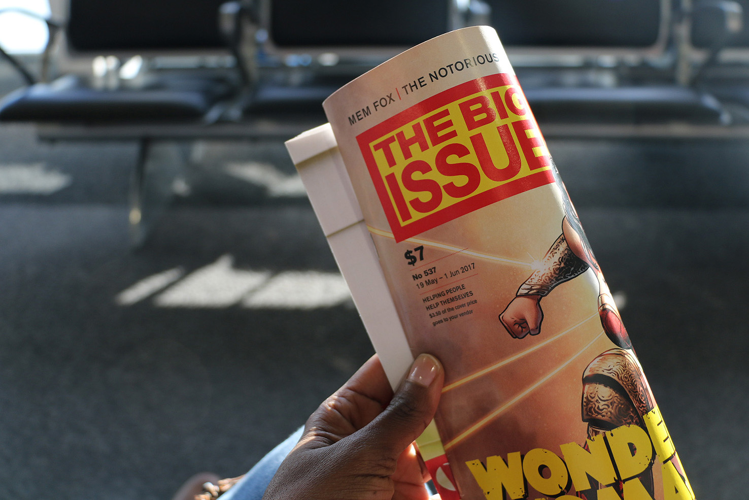
The cover always grabs my attention, even through the plastic. In this issue the striking red in the logo block matches the red of their regular subscription sticker. The sticker says, “I have subscribed to The Big Issue Magazine to help employ homeless women.”
Wonder Woman is also very prominent with her large mane of black hair and I am sure this cover caught many eyes as the vendors sold it on the streets. The movie is showing in cinemas everywhere and there are Wonder Woman reviews and images galore online.
In the podcast episode I also talk about the names at the top of the cover and the importance of that $7 cover price.
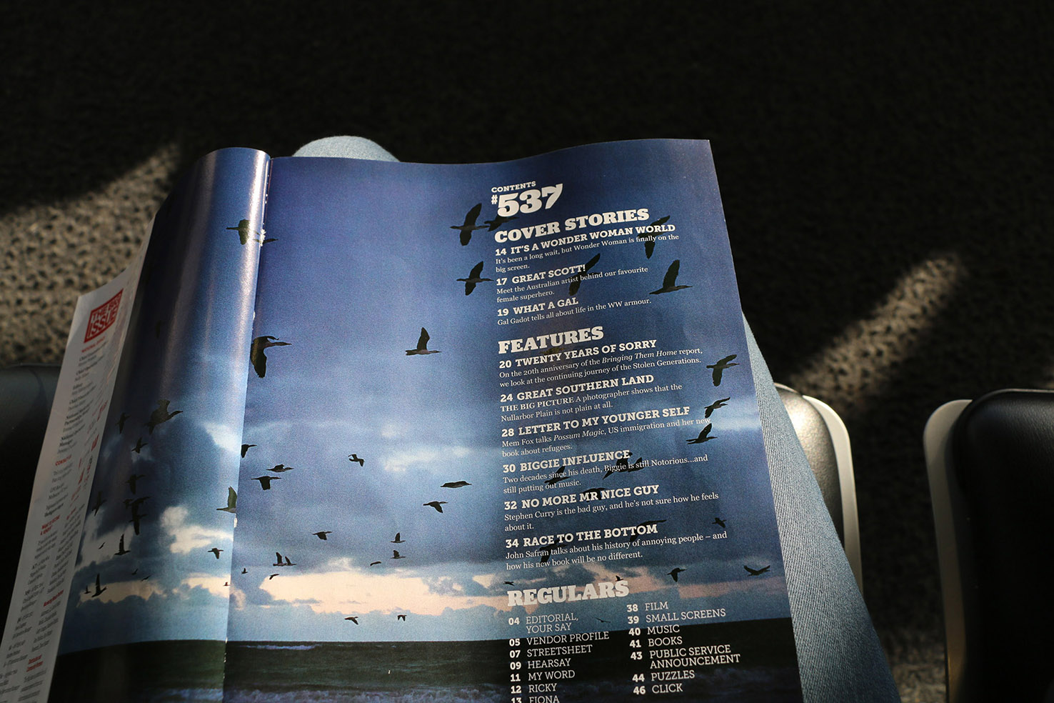
Design a clear table of contents
I think the white text on the blue background looks effective. Your eyes immediately follow the words and the page numbers.
Tell us about your people
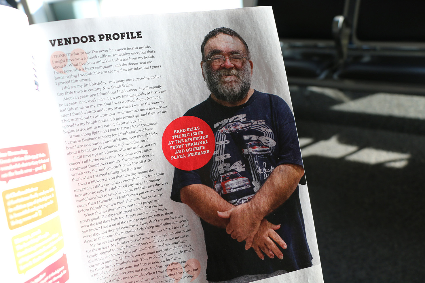
I always enjoy reading the Vendor Profile section. This includes stories of the people who are on the streets selling the magazine. This is lovely Brad from Brisbane.
Creatively showcase creativity using columns
The magazine uses columns in most of its sections. Two in some, three in others, depending on the content. The Streetsheet section is a good example of how the columns improve the layout of stories and poems submitted by vendors.
Kick a punch with the cover story
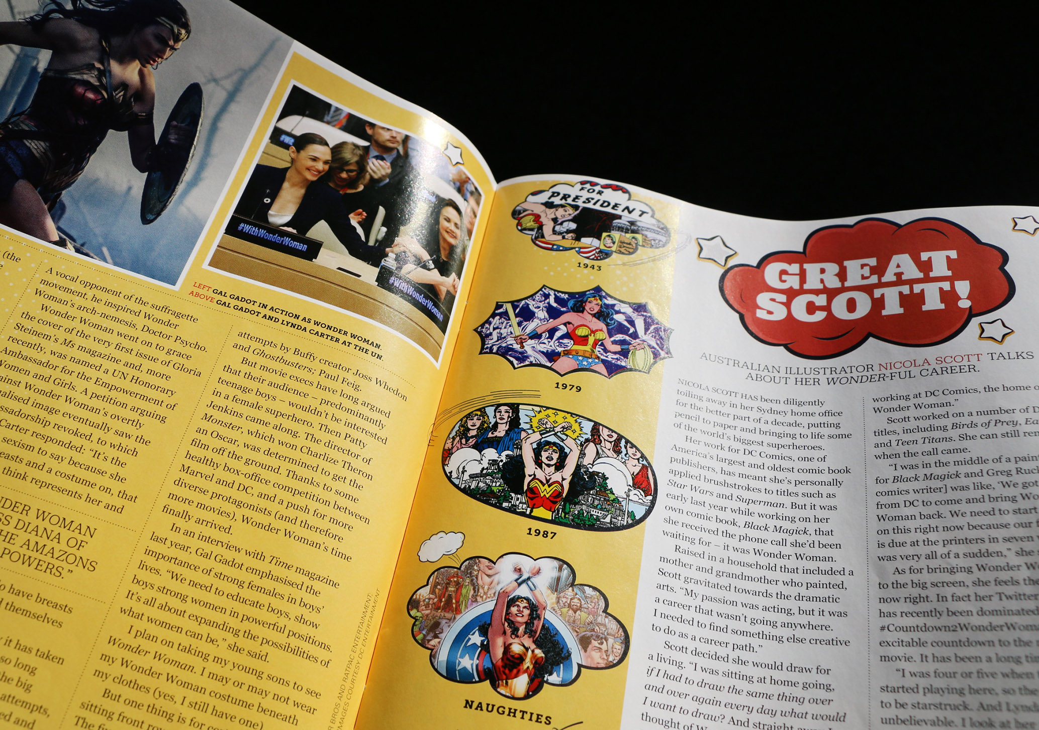
The use of photos, comic illustrations, bright backgrounds and white borders makes this cover story stand out. The bold Wonder Woman cover ties seamlessly with this article. Notice how that red cloud with ‘Great Scott’ helps to continue the red theme I mentioned at the start?
Use contrasting topics, colours and tones
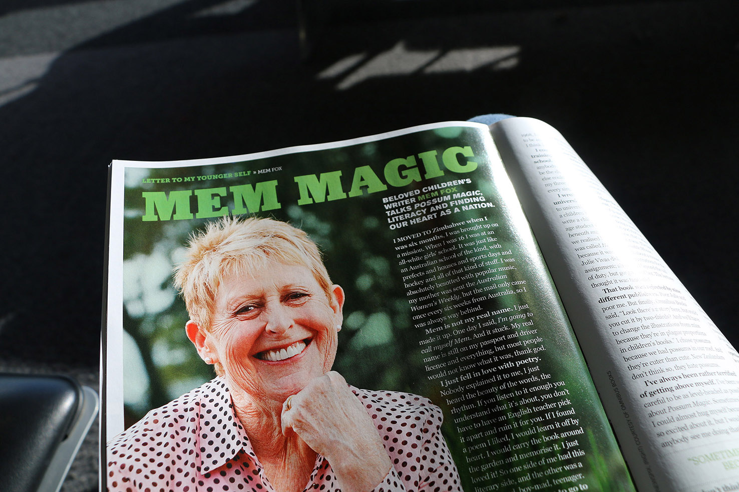
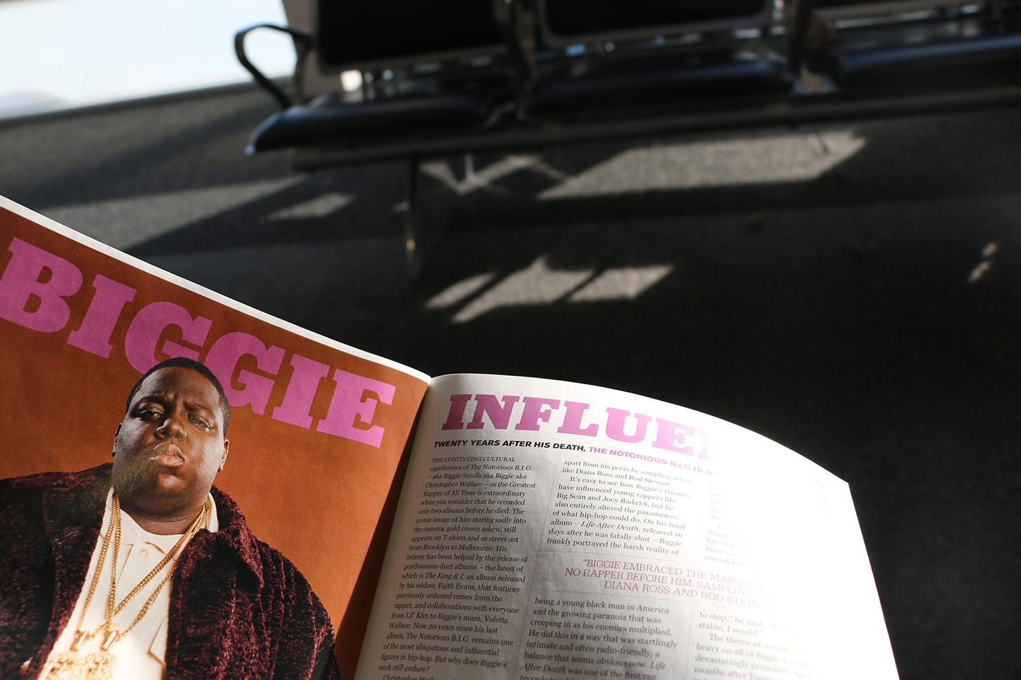
We go from the bright yellows and reds of Wonder Woman to some darker tones. There are contrasts in content too – an article about Mem Fox, a renowned Australian children’s author, to one about hip-hop icon the Notorious B. I. G. Go figure!
Review a book or two
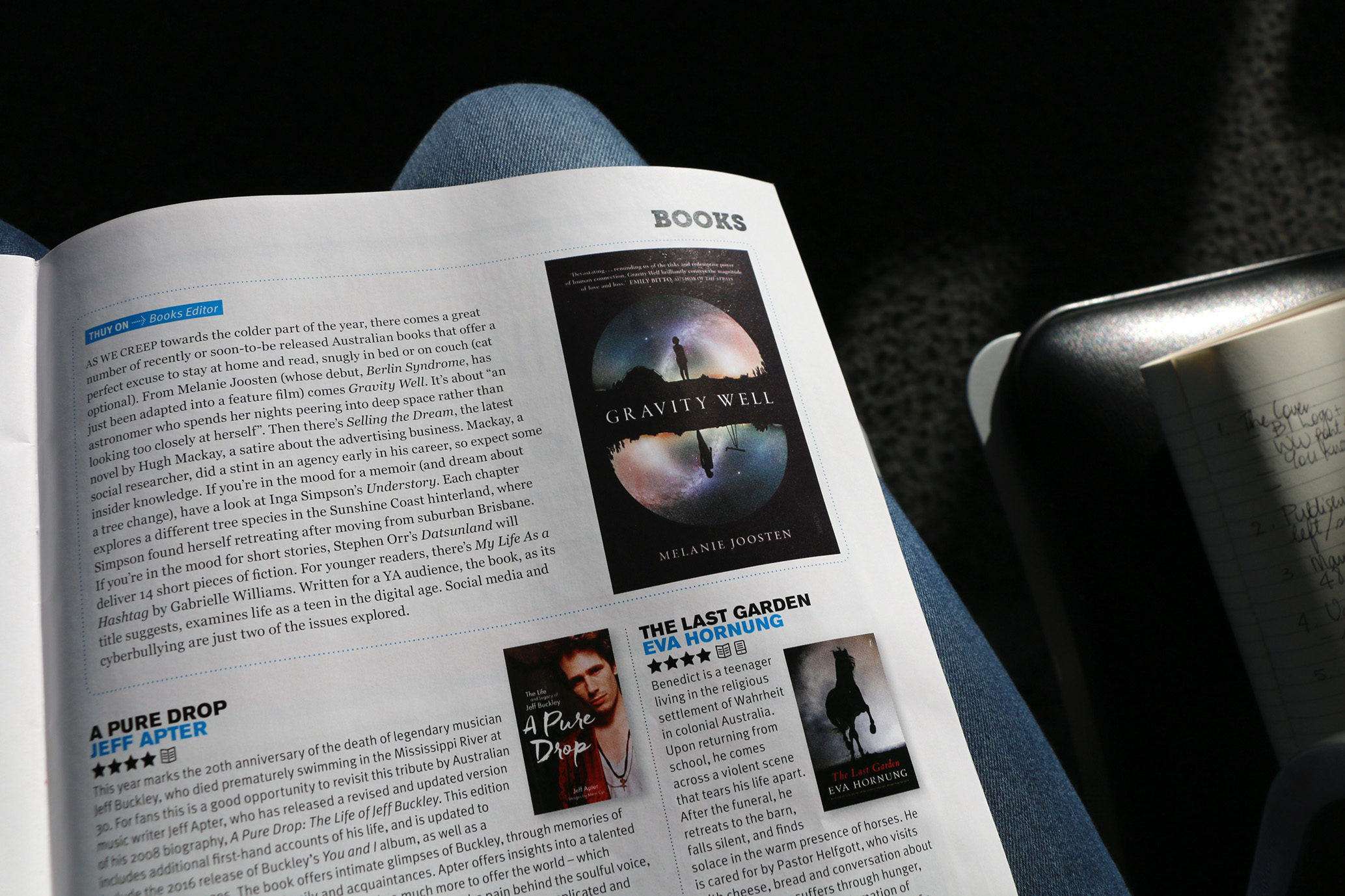
I love that The Big Issue regularly reviews music, film, TV and books. They stick to one art form per page and then review 3-4 items per page. The small images of book covers, album covers and TV scenes add interesting layers to the magazine.
It is a lovely surprise to find Melanie Joosten’s upcoming book Gravity Well in this issue. (Listen to us discussing her book and movie Berlin Syndrome in Episode 14 https://taku.com.au/melanie-joosten-berlin-syndrome/).
Give us word play for days
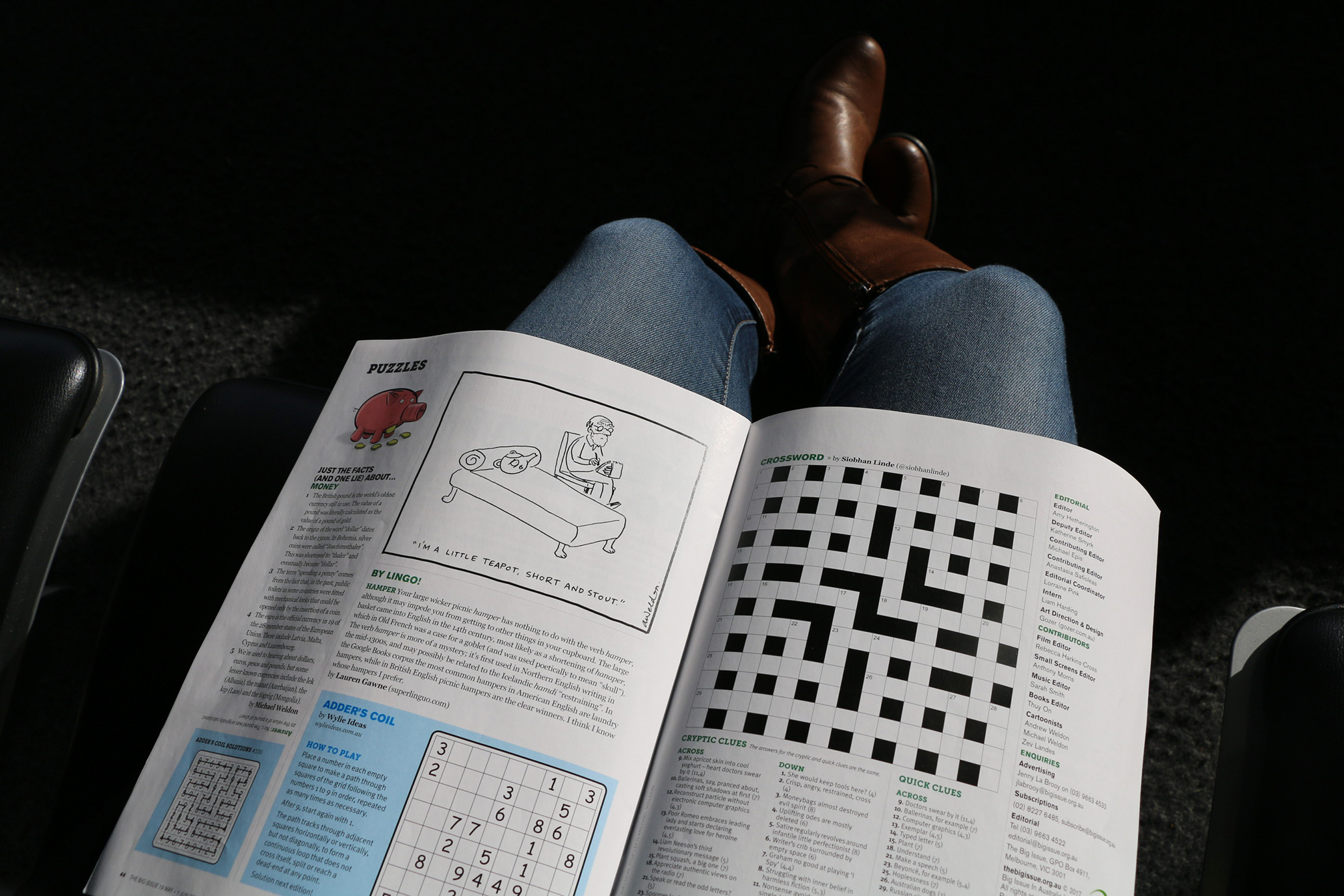
I love the crosswords, number puzzles, fun facts and illustrations that are towards the back of the magazine. The minimal use of colour on these pages actually helps me think better!
End with a call to action
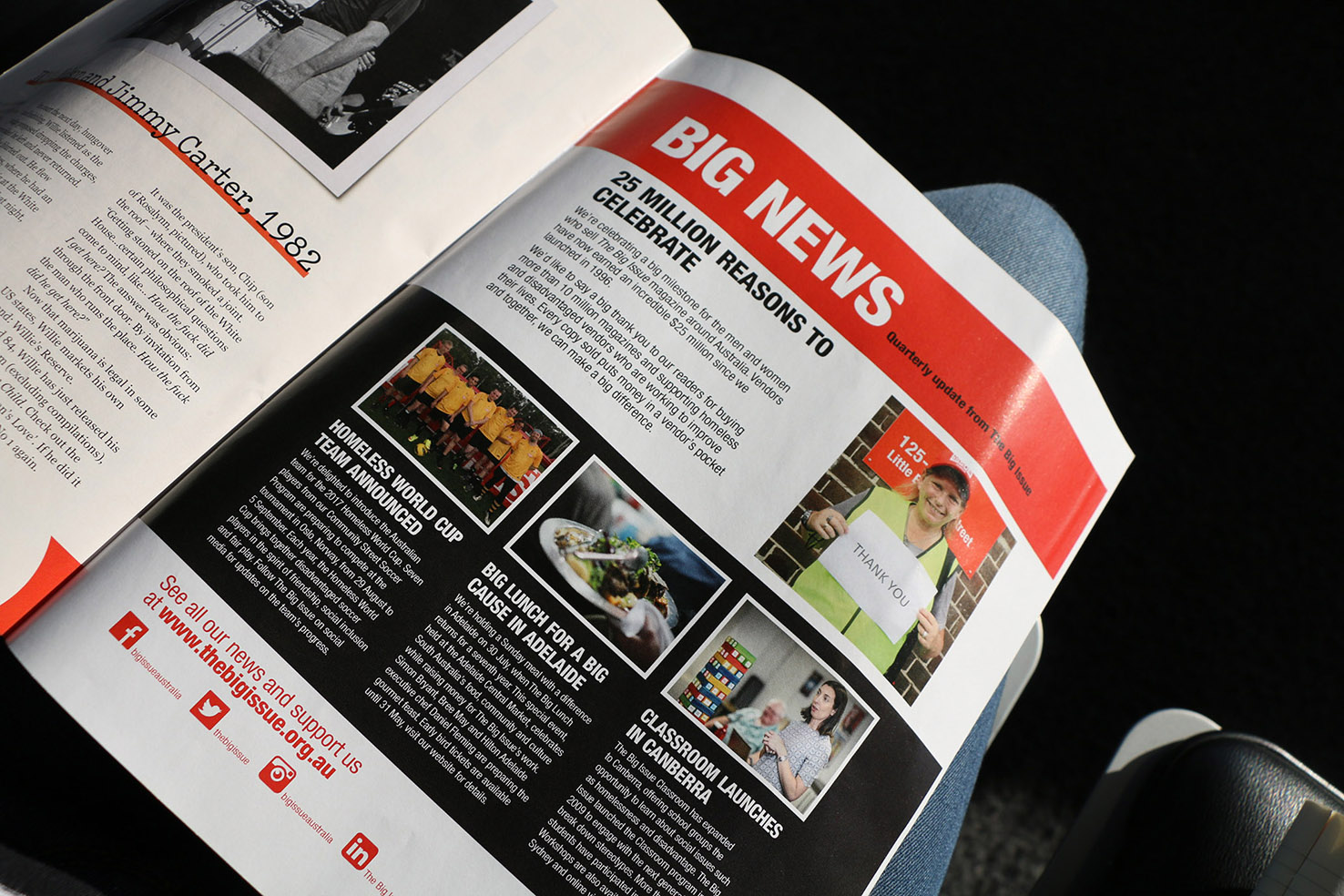
The last pages are often an advert or in this case, information about upcoming milestones and events. I like that there is a considered and considerate balance of how The Big Issue invites support for its work.
Invite the community to contribute stories
The magazine makes it very easy to share your stories. You don’t have to be a fancy pants author to pitch your story ideas. If you are a writer in Australia, fancy pants or not, I recommend you check out their Submissions page at http://www.thebigissue.org.au/contribute/.
Make it easy to share
Finally, I like that the magazine is light and easy to carry around. Most times I try to leave my copies somewhere other people can read them e.g. the office kitchen. It just shares the love around.

