Episode 29 – Rogue Resumes to Sexy CVs – 3. Add Graphics
How to add graphics to your resume or CV.
Rogue Resumes to Sexy CVs is my technical writing series to help your CV look a bit better in Microsoft Word. In this podcast episode I talk through how to add simple graphics to your CV – mainly colourful headers, footers and page borders. (Skip the intro and start at 4:21) Blog post and screenshots at: https://taku.com.au/rogue-resumes-sexy-cvs-add-graphics/
Important notes:
- Curriculum vitae (CV) or resume (also spelt résumé – people often leave the accents off) essentially refer to the same thing. I’m talking about the document you list your qualifications and experience in when you are applying for a job.
- The examples and templates I use are general guides only – some steps may not suit your CV, experience or some job applications. Disclaimer: you may find typos, grammatical errors and random placeholder text in there!
- The series describes the steps for Microsoft Word on Windows.
- If you have questions, leave them as comments and I’ll try my best to answer them.
Download the Microsoft Word template
Your Name CV Template_Colour (Word, 19 KB)
You can work in your own CV or you can download and play freely in this template Your Name which already has columns (Part 1) and colour (Part 2) in it from the previous episodes.
Here’s why I think adding graphics to you CV helps:
- It shows boldness and creativity.
- It makes the CV stand out from the pack
- Why not?
I’ve used the term “graphics” quite loosely and I’m talking about images, photos, smart art, shapes.
Should you add your photo to your CV or resume?
Well, people love to debate this. Google it and see how much is out there. I think you should only include your photo if:
- that’s how you genuinely look (don’t Photoshop yourself too much)
- you have the photo in the right proportions
- you don’t look like a serial killer (open to interpretation)
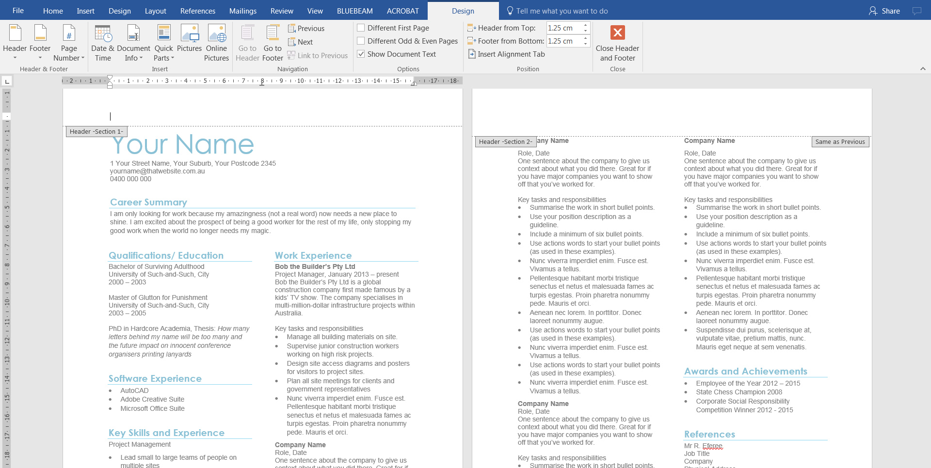
1. Go to the header section in your document
I’ve changed the theme colour to blue to mix things up. Double click into the header space to reveal the Header and Footer Tools.
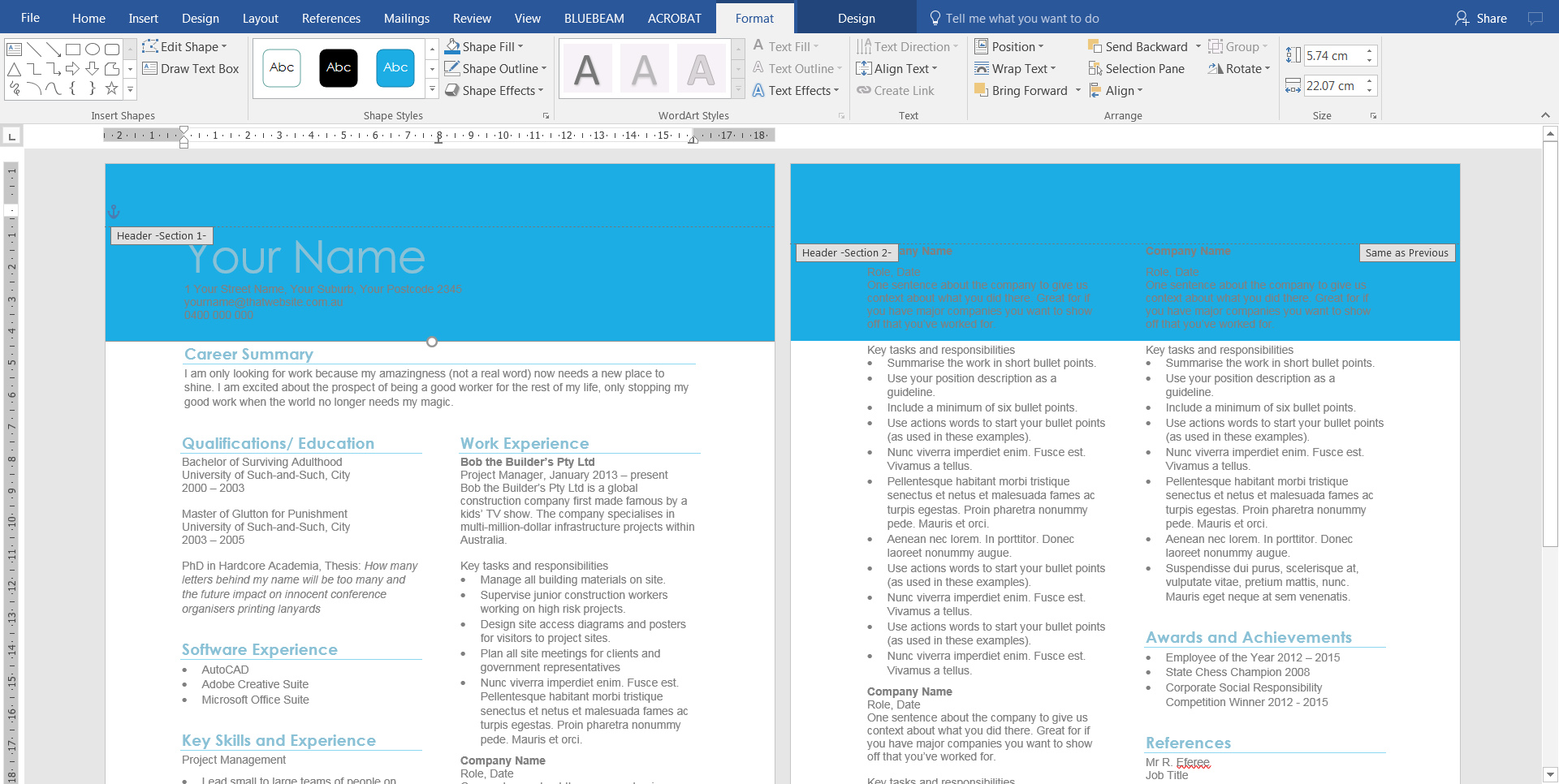
2. Add a rectangle shape
Still in the header space, insert a rectangle. Select the rectangle to reveal the Drawing Tools. Shape Fill – blue; Shape Outline – none. It might look and feel ridiculous, but trust me, there’s a method to the madness.
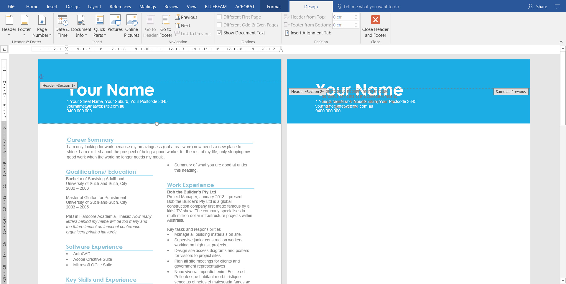
3. Move your name and address to the header
Double click in the main body of your text to get out of the header editing mode. Then select your name and address. Ctrl +X to cut it out.
Now go back to the header space and paste it there. (Ctrl +V) Then change it to white so it stands out against the blue header shape.
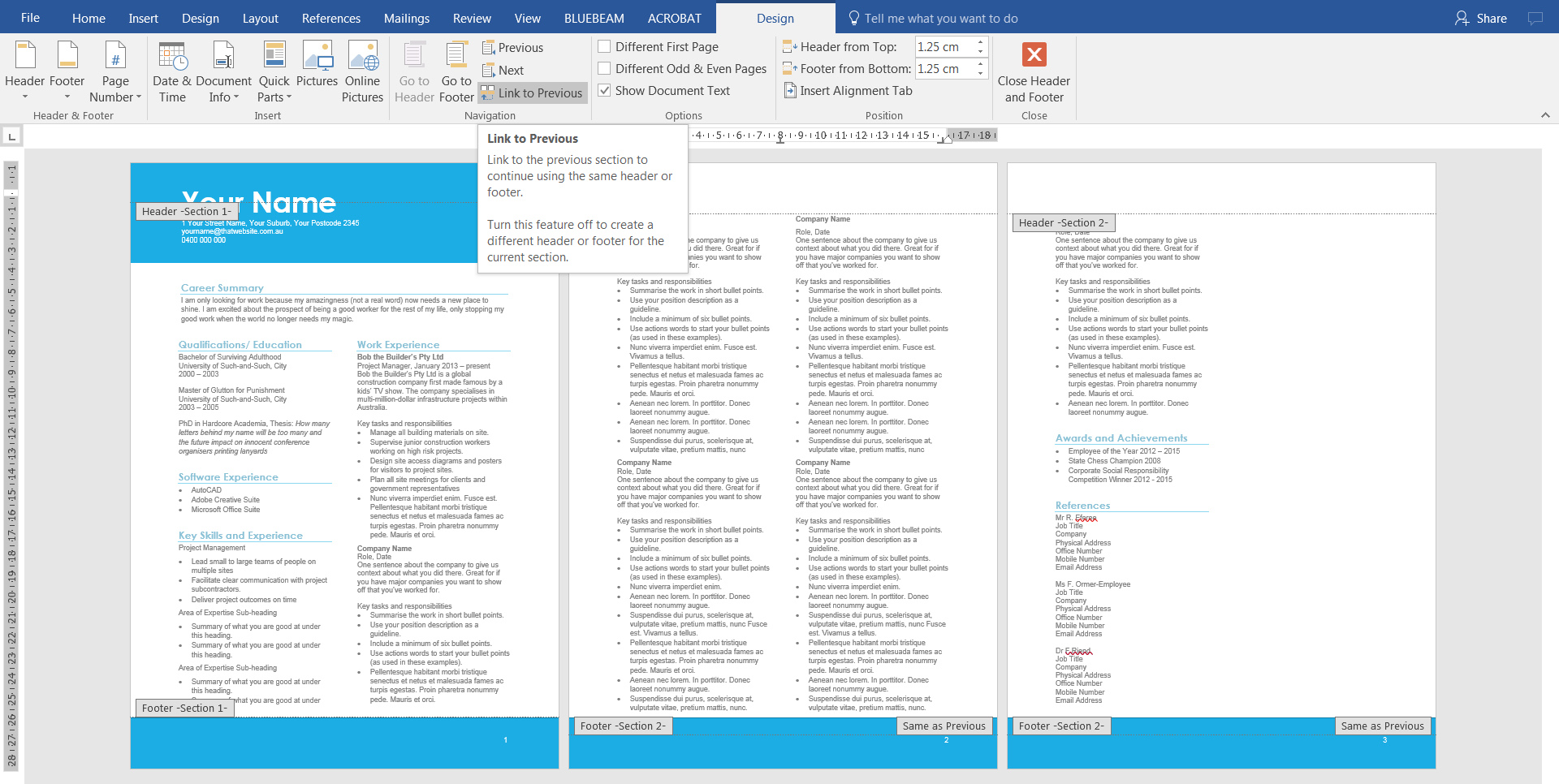
4. Deselect Link to Previous for your header
Notice that your header shape, name and address are showing across both pages? We don’t want that, so go to the header space on Page 2 and deselect Link to Previous in the Header and Footer Tools ribbon. We are using this option because we have a section break on the first page. (It’s a long story to explain, but if you really want to know, email me and I can help you).
Now remove everything in the header space so it’s blank at the top.
Repeat everything you have just done in the footer space, except for copying your name and address. Instead simply add a page number in the bottom right hand corner. (Page Number should be the third option to your left in that Header and Footer ribbon).
5. Add a page border to your CV
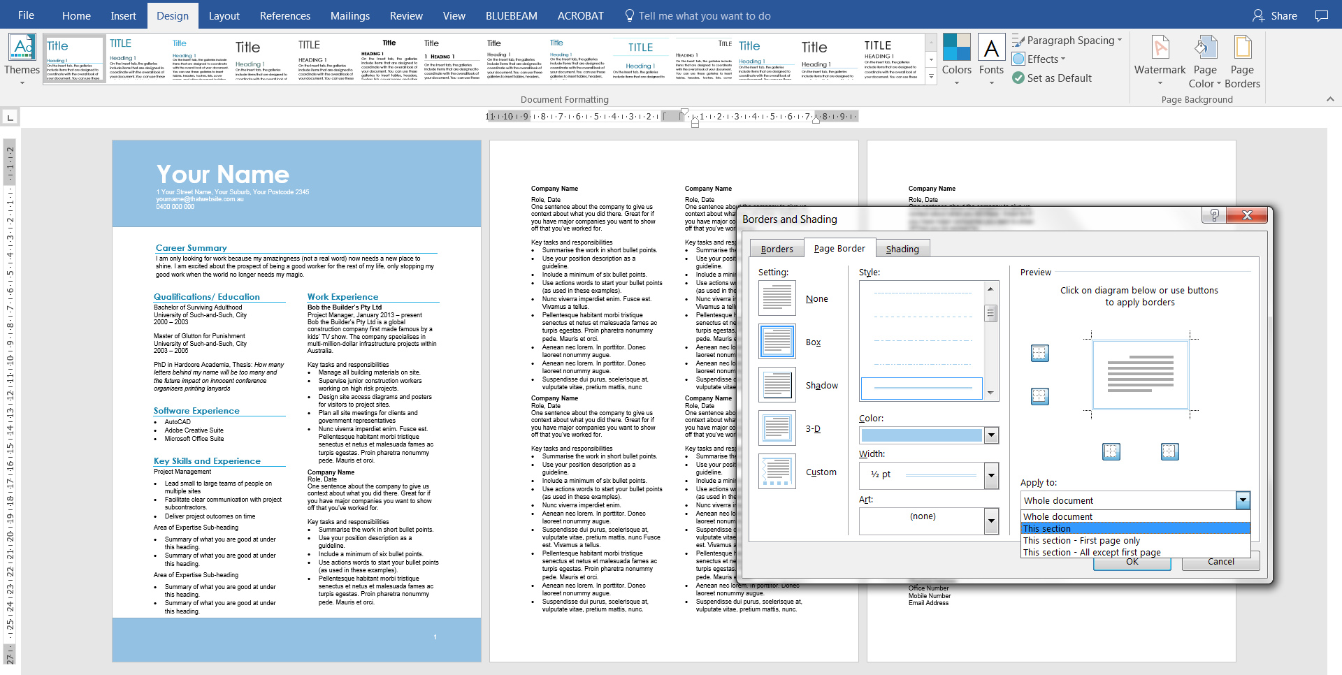
You don’t need to use shapes in the header and page borders – I’m just showing you what they could look like. Go to Design > Page Background > Page Border and this window should appear. Select Box, then a colour and most importantly, select This section only from the Apply dropdown box.
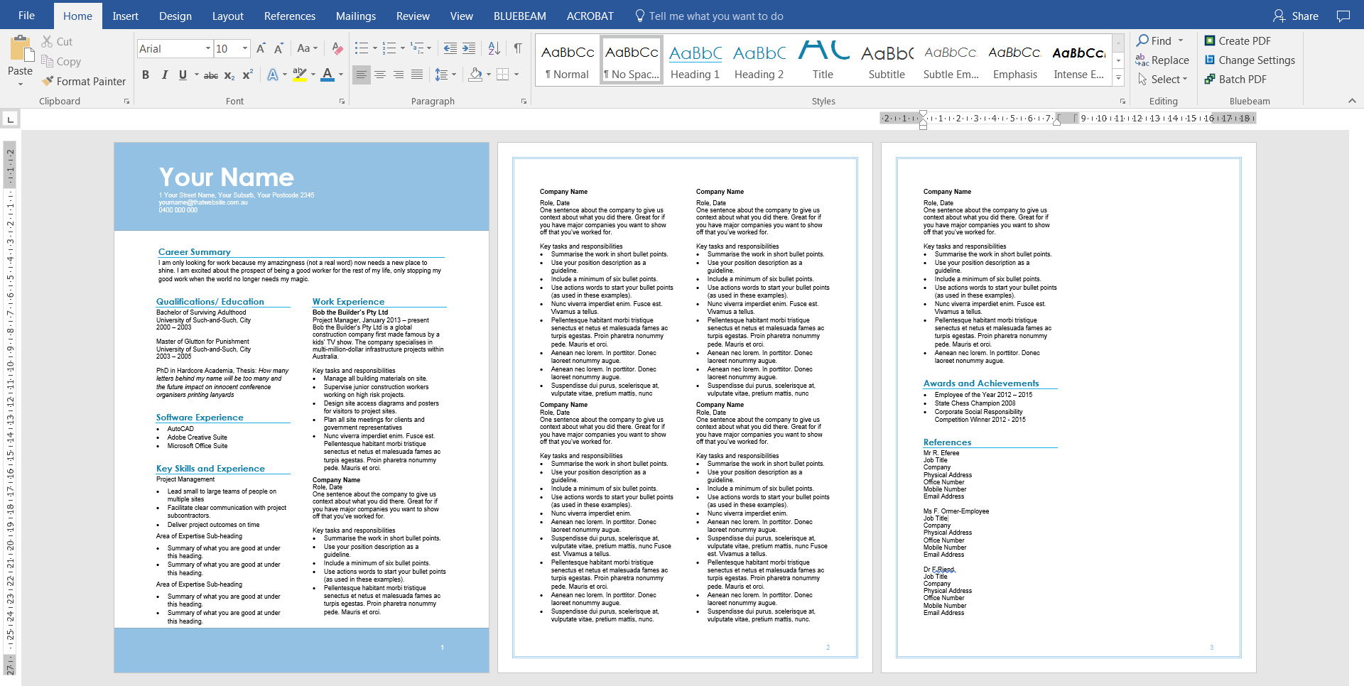
Now your CV should look like this:
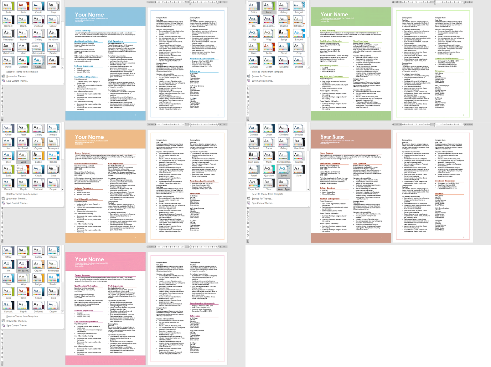
6. Play around with the themes again
Rather than manually changing colours using the format options, simply play with your Themes button at the top again. Oh look at those magic colours changing automatically! (Definitely refer to Part 2 https://taku.com.au/rogue-resumes-sexy-cvs-add-colour/ if you’re not sure how to do this).
And we’re done!
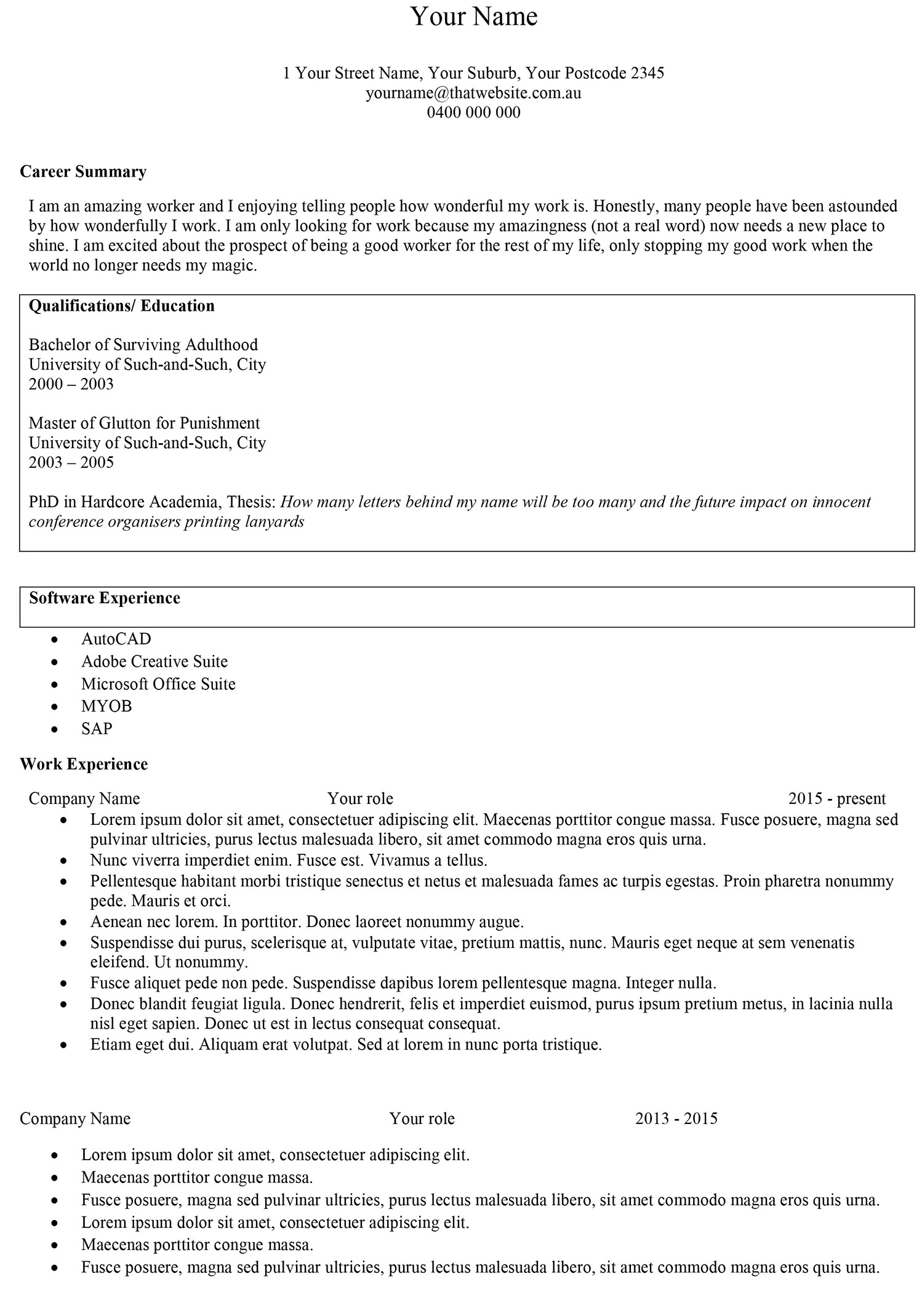
We’ve gone from this:
to this:
Here’s Your Name Template_Final (Word, 19 KB) with columns, colour and graphics for you to play with.
I hope you’ve found the Rogue Resumes to Sexy CVs series useful. Thank you for listening…and reading!

